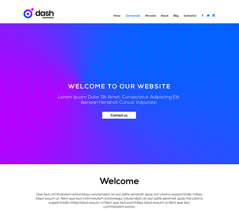
Design One
A businesslike design, ideal for brokers with a focus on commercial lines. The theme is based on Dash’s bold colour scheme with subtle shapes and gradients adding depth to the page.
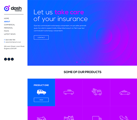
Design Two
A condensed homepage features the menu on the side for a point of difference. No space is wasted in this design with a simplified structure based around icons and colour pops allowing an easy and clear user journey.
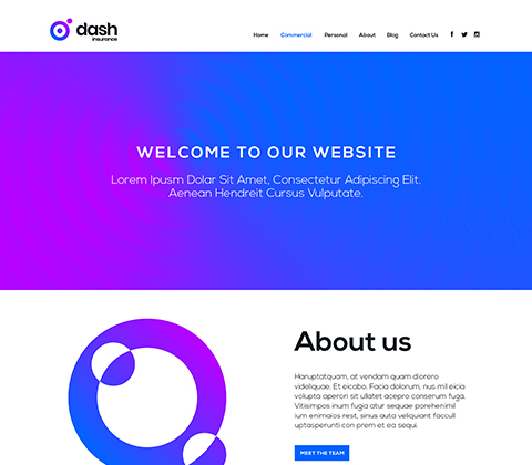
Design Three
Engaging and bright, the use of white space through the site keeps it bright and welcoming. The homepages features a mix of content which keeps the user engaged and interested. The theme once more is graphical and icon based. This keeps the brand looking contemporary.
To ensure we can move forward with the project in a timely fashion, the final date for feedback for these designs is the 14/08/2019